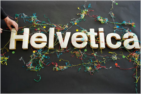
Helvetica is a rational typeface, it presents visual expressions of the modern world in a legible and intelligible way. Its creation involved doing away with the manual details, and creating a more neutral typeface. The typeface had no meaning, but the meaning would be contained within the content of the text itself. The design of the typeface is all about the interrelationship between the negative shape, the space between the characters hold the letters. Each letter lives in a powerful matrix of surrounding space. When corporations use helvetica, it makes them appear more accessible and comfortable.
There was somewhat of a revolution against the overused helvetica typeface, and types similar to it, through the emergence of a period of grunge typography. During this time, typefaces were hardly recognisable, and were messy. Eventually type reverted back to the old ways, but with new rules to govern it.
It is evident that it is almost impossible to improve helvetica, it has an inherent rightness in its form. It is UNFIXABLE.
No comments:
Post a Comment