These contemporary designers, all revolve around typographic based work, and use illustrative type as an image, and are all highly experimental in their work. They all reject the clear cut nature of modern typography, and embrace their own individual styles to deliver their message. Their post modern works are unique, but effective. Their work is emotional and powerful, using inventive lettering to create a fusion of science and design.
Wednesday, April 28, 2010
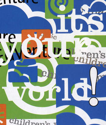
Post Modernism
Post modernism, obviously came after modernism, but what are the characteristics of design from this period? Considering that this movement arose out of a rebellion against the clean styles of swiss modernism, post modernism introduced a radically different perspective to society. Firstly, the objective of designs are constantly changing. This movement is a state under which everyone's individual expression is true. in an essence, anything goes. Truth is no longer universal, and there are no strict rules. There is a great sense of individual style within designer's works, and many doors within design as a whole have been opened due to post modernism. It is the contemporary style which we as designers now follow. Anything goes, there are no limits or restrictions to design today.

DAVID CARSON
STEFAN SAGMEISTER
Late Modern, and Swiss International
This period spanned from 1945 to 1970, and was dominated by American innovation, and inspired by the European avant guard movement. During this post-war period, German and Russian artists moved to America, which was at the time the cultural centre of the world. Early modern styles of design evolved into promoting the capitalist government of the USA, and the dogma of early modernism was discarded. Most designs followed the principle of function before form. function of the design was the main objective for designers of this period. For example, Frank Lloyd Wright constructed buildings which fir into the landscape, he was all for the merging of natural and man made styles. Wright said that designers can have their own style, instead of simply following the trends, but he still put function first.
Late modernism was a combination of function and simplicity, designs revolved around simple aesthetic elegance. In essence it was a merging of
organic shapes and simple geometry. However, the Italian designers of this era always took things two steps too far in regards to outrageous designs. This was due to their history in fine art.
Art and design cross-fertilise each other. As Paul Rand said, "To design is to add value and meaning...To design is to transform prose into poetry."
In terms of posters of this era, typography and illustrations were generally simple, there was a fusion of image and typography,overlapping shapes, and designers were developing their own styles, within the set norms of design at the time.

SWISS INTERNATIONAL
This design movement coincided with late modernism, starting in 1945, and ending in 1985. This was an international style, which was very austere and simple. The success of this movement was hinged on the adherence to the grid, the grid is god in the swiss international movement. The grid aligns the pieces of work, and everything must fit into the grid. All designs are extremely clean, uniform, scientific, and socially useful. It was extreme abstraction based on pure geometry. All of the typography was minimal, and unity was achieved in designs by repetition of shapes. Many pictograms e use today emerged out of this period of design.

Wednesday, April 14, 2010
“Don’t confuse legibility with communication”
The statement, “Don’t confuse legibility with communication”, reflects the attitude of post modern artists towards swiss modernism. Basically, the post modern movement brought about a revolution in terms of style and presentation. Artists like David Carson were catalysts for this change of attitude. They were simply fed up with seeing the same typeface and style in almost all swiss modernist works. This attitude brought about the post modernist movement, which introduced “different” and unique styles to society. Not only in regards to typography, but the style as a whole. Where the swiss modern camp would have clean, clear, and simple styles of typography, post modernism challenged this with grungy fonts, and indistinguishable and unique typefaces. This is where the above mentioned statement comes into play.
Through the eyes of a post modern artist, the message to be conveyed, through a piece of art, does not need to be stated in a clear visual manner. In fact, many post modern pieces, are grungy and practically illegible. However, these are still effective pieces of work, as the message does not need to be in the content of the text, but in the visual appeal of the typeface. This is what Carson meant when he made that comment. The revolution against Swiss modernism introduced a new style, and way of thought, through the post modern movement.
In the 50’s, the aesthetics of objects and designs was generally highly intricate, and constructed with purpose. The post modern mindset opted to move towards deconstructive aesthetics. Post modern artists were bored with the modernist ideals, clean designs, and wanted to experiment with many new forms and processes of design.
For instance, a post modern artist, Stefan Sagmeister, even experimented with cutting typography into his own body.
In comparison to the very strict, clear cut ideals of Swiss modernism, post modernism brought forth an extremely experimental mind state, wanting to move away from the so called norms of design at that time. The rational and organised nature of swiss modernism did not fit in with the irrational, and anarchical thoughts of the post modernist designer. The film Helvetica explores this concept, but not in great depth. However, it makes reference to both Carson and Sagmeister, and their revolt against Swiss modernism.
Helvetica as a typeface, represents the modernist movement quite well, with its clean lines and extreme legibility. It is, still used very widely across the world, some would say it is over-used. The precise reason for postmodernism, not the typeface, but the fact that everything starts to look the same, and there’s nothing truly different. This is why, Carson would state, “Don’t confuse legibility with communication”, as communication is the purpose of art and design, the transmission of a message. How we transmit the message does not have to be legible to be effective.
Subscribe to:
Posts (Atom)