Sunday, March 28, 2010

Helvetica


Helvetica is a rational typeface, it presents visual expressions of the modern world in a legible and intelligible way. Its creation involved doing away with the manual details, and creating a more neutral typeface. The typeface had no meaning, but the meaning would be contained within the content of the text itself. The design of the typeface is all about the interrelationship between the negative shape, the space between the characters hold the letters. Each letter lives in a powerful matrix of surrounding space. When corporations use helvetica, it makes them appear more accessible and comfortable.

There was somewhat of a revolution against the overused helvetica typeface, and types similar to it, through the emergence of a period of grunge typography. During this time, typefaces were hardly recognisable, and were messy. Eventually type reverted back to the old ways, but with new rules to govern it.

It is evident that it is almost impossible to improve helvetica, it has an inherent rightness in its form. It is UNFIXABLE.


Sunday, March 21, 2010

Punch Magazine and Marshall McLuhan

PUNCH MAGAZINE
This example from Punch Magazine alludes to the Shakespearian text, A Midsummer Night's Dream. It makes a political statement through the use of the classic, cartoon, Uncle Sam.

MARSHALL MCLUHAN
Was a Canadian scholar, who specialised in media theory. He quoined the phrased "The medium is the message", which related to the relationship between medium and the message, and how the medium influences how a message is perceived. He proposed that the medium itself should be studied, not merely what the medium carried. The medium also effects society not only the content which the medium carries. He stated that the content on the medium had no effect on society, but the medium itself was the major influence. He stipulated that television would have the same effect on society no matter what types of programs were showing. He was highly controversial, and will always be remembered for his media theories.


American Kitsch

1945 marked the end of World War 2, which meant there was a general atmosphere of optimism about the future in the air. This was the zeitgeist of the time; looking to the future with bright-eyed optimism. There was mass excitement about the technological innovations and advancements which were occurring, and designs at that time were taking a futuristic turn. Aerodynamics, and space crafts heavily influenced the design of products in this era. Products had to look "modern", however much of the styling was superficial and had nothing to do with the function of the product itself.

The word kitsch literally means "in bad taste", and designs associated with this era are often pretentious and vulgar, but often have a sentimental theme behind them. It started as a radical movement, emerging from the emergence of sub-groups in American culture, but eventually became mainstream. The sub-group icon, James Dean, heavily influenced the beginning of the movement in America, as he promoted a rebellious image to society.

Aeroplanes were perhaps the greatest influence on 50's design, there were dynamic curves and lines, and themes of space travel. Aerodynamic styling found its way into automobiles and architecture, with many buildings having a "space age" feel to them.

In terms of type, casual scripts and italics ere typical of the design at that time. The text was generally loose, and crazy. While designs themselves were constructed using semi-geometrical curves and quasi-modern looks. The electric guitar and jukebox, created in this era, were manufactured with aeroplanes and aerodynamics in mind. Posters and packaging at this time usually depicted people with exaggerated expressions, cartoon looks and caricatures. Drama was usually emphasised, script was hand drawn, and the colour scheme was bright and loud. Another characteristic of design at this time was the used of disembodied heads, seemingly floating around the page.

In comparison to today's society, it seemed like a much more innocent time to live in. The atom bomb was used in a romantic way to sell many products and services.

Many modern designs reference this era of design, there has been a revival in kitsch-style appliances and car interiors.

Tuesday, March 16, 2010

John Heartfield

Was a German artist who pioneered the art of photomontage, which involved the combination of two or more images to create a whole new image, similar to collage. Heartfield's purpose was to make political statements through his works. He used his art to protest the Nazi rule of Germany, specifically Hitler's third reich. He achieved this by using political images, and satire to convey the message of protest against the greedy government of Germany.

The text on this poster
translates to:

THE REAL MEANING OF THE HITLER SALUTE

THE LITTLE MAN ASKS FOR BIG GIFTS

I'VE GOT MILLIONS STANDING BEHIND ME


This poster makes a statement about the nazi-fication of the church.


THIS IS THE "HAPPINESS" THEY'RE BRINGING

A good example of early photomontage by Heartfield.


As you can see, Heartfield effectively used photomontage to convey his message to the public.


Friday, March 12, 2010

Modernism

It all started before the industrial revolution, in a time where people were moving away from religion, and towards science. A time called the Scientific Revolution, which occurred in the 17th century. It revolved around the ideal of the search for enlightenment, and seeking answers. This period led to shifts in power, and changes in the class of individuals. Consequently, many revolutions occurred, around the world, due to this change in political and social philosophies.

An important word to use in relation to the whole modernist movement is zeitgeist. This means something that was prominent in the air of that era. Changes in society led to the Bauhaus movement, which contained many textile artists, painters, sculptors and designers. It established rules for design, and stated that "less is more" focusing on reductionism. Constructivism followed, which started in Russia, by using the ideas from the Bauhaus movement for political propaganda design. it involved reducing objects to their basic elements, and was highly idealogical. Descartes brought about a new stage of philosophical thought, a more complex idea of personhood. While Neo-Classicism revived an interest in antique art, and involved art educating the viewer.

Experimentation was a common ideal in the early modernist movement, as a result of dissatisfaction of the past, and artists looking for radical change in society. Cubism sums up this movement away from the norms of society, where artists introduced multiple shapes and viewpoints into their works, changing the way society viewed things. Futurism and Dada made statements about the nature of society at the time, rebelling against the strict norms established in the past. The Swiss modernist movement introduced much more freedom into art, and removed the rules, which led to surrealism.

Friday, March 5, 2010

Arts and Crafts
and
The Art Nouveau Movement

THE ARTS AND CRAFTS MOVEMENT
Came about after the industrial revolution, as a form of rebellion against overproduction, and over working labourers. It focused greatly on the creation and detail of a product, and the movement was a reaction against the poor aesthetic qualities of products manufactured during the industrial revolution. It could be considered a socialist reform which started in Great Britain, and embraced al types of artists in the production process. Artists care about the way things look, as opposed to the monetary benefits of production.

The Arts and Crafts movement acted as a bridge between traditional Victorian values, and the modernist movement. It was a case of complicating objects opposed to simplifying objects. It represented a balance of harmony with complexity within pieces of work.

An important figure, and seen as the founder of Arts and Crafts, was William Morris. He dedicated his life to re-establishing the values which were once in place before the industrial revolution. He was all about making things "less ugly", through the use of organic shapes and natural materials within the deigns. In an essence it was about establishing the unity of the pieces of art as a whole. Morris emphasised craftsmanship, and the truth to materials to ensure the most aesthetically pleasing outputs of work were created.

In summary, the Arts and Crafts movement involved returning to the creation of work which was pleasing to look at, and rebelling against the mass production of the industrial revolution. Craftsmanship was an important concept, which was an essential part of this movement as a whole.

Here is an example of work from the Arts and Crafts period:


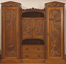
Notice the intricate carving on this piece of work, great attention has been paid to detail, and craftsmanship. The organic shapes carved, are typical of the Arts and Crafts era.
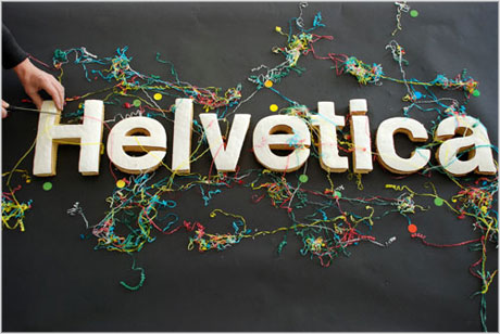


ART NOUVEAU
Literally meaning "New Art" in French, this movement was a direct descendant from the arts and crafts period, and was the first style that spread internationally. This style was used commercially to enhance the beauty of industrial products. Sinuous organic curves were used in the works, which were more free in comparison to those used in the arts and crafts movement. Many of the lines used were plant-like and energetic. It was also essential to ensure that form and function were working together. This movement was also, similar to Arts and Crafts, honest to the materials that were used. Aiming to enhance the function of the materials.

This movement drew heavily on inspiration from Asia, due to increased trade. A large influence from Asia, was woodblock printing from Japan. This had a large impact on posters created at the time, as the shapes used were highly abstracted, and usually had black outlines around objects on the poster. The posters of this era, also usually contained cut-off people in the foreground, bright lights, and often a focus on a subject in the distance. The type had highly organic shapes, only some graduated colour, and little modelling was used. Many of the posters were life-sized, and this could be seen as the beginning of the billboard.

Many of the designers at this time used idealised beauty in their works, depicting women with a "perfect" and elegant shape. Many of the women painted looked self-assured, and quite beautiful.

In terms of composition, there were dynamic spacial relationships, which gave the picture energy, and often destabilised things. The works of this time, were often asymmetrical, where colour created unity and guidance within the images. An example of a designer who summed up all elements of this design movement, was Toulouse Lautrec.

Lautrec used very simplistic shapes, inspired by Japanese printing, also he repeated these shapes and included organic curves. He often abstracted these shapes, simplifying them further. Here is an example of his work:

Look at the simply shaped blocks of solid colour, and organic curves of the feminine body. The style is simple, yet sophisticated, summing up this whole era of design.

The Art Nouveau style made a resurgence in the 60's, where it re-emerged through some of the psychedelic works.